Okay, based on comments from multiple sources, the design isn't hitting the chord I was aiming for. I'd been looking for a free template yesterday and it seemed like all the women I saw on them were half naked. Nothing wrong with that, women are flat out pretty. But I started wondering where all the half-naked men were. And then I decided I'd like a half-naked man template.
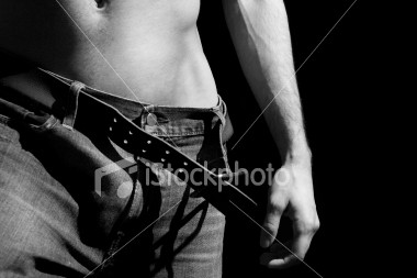
This is the first photo I found and the one I ended up using. The one that apparently seems a little feminine. Would that be fixed if I put his hand back in the header?
This is the first photo I found and the one I ended up using. The one that apparently seems a little feminine. Would that be fixed if I put his hand back in the header?

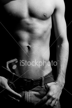
Or there's this one. It was a very close second choice for me. Very very close. Yum. Heehee.


3 Comments:
The first one's feminine? Okay, maybe it's a lack of seeing a naked male body lately, but I knew what that was (and why you chose it) as soon as I saw it. I personally think the hand being in the photo takes away from the central composition area you have going without it.
I do agree with choice number two. YUM! :D
I'd take either and didn't think the first one was girly either.
HH6
I loves me some nekkid man-chest. :)
Post a Comment
<< Home